Cover A Singapore home by Prestige Global Designs features Gucci wallpaper in a hue that is very Viva Magenta, Pantone's Colour of the Year Photo: JASPER YU / JYU STUDIO

From Viva Magenta to Wild Wonder, take a look at Pantone and Akzo Nobel's Colour of the Year, and how they could refresh your home

An unconventional shade for an unconventional time is how Pantone describes its Color of the Year 2023: Pantone 18-1750 Viva Magenta.

This distinctive shade, between blue and red, warm and cool, vibrates with vim and vigour. It's a shade rooted in nature descending from the red family, demonstrating a new signal of strength, especially welcome after a global pandemic.

Now in its 23rd year of selecting an annual colour, The Pantone Institute considered the challenges of recent years and how they have shaped perspective, values, and attitudes when finding a colour for 2023.

"In this age of technology, we look to draw inspiration from nature and what is real. Pantone 18-1750 Viva Magenta descends from the red family and is inspired by the red of cochineal, one of the most precious dyes belonging to the natural dye family as well as one of the strongest and brightest the world has known," states Leatrice Eiseman, executive director of Pantone Color Institute.

"Rooted in the primordial, Pantone 18-1750 Viva Magenta reconnects us to original matter. Invoking the forces of nature, the colour galvanises our spirit, helping us to build our inner strength."


Tatler Asia
Above Enter the Magenta-verse

With this in mind, Pantone also considered the increasing influence of technology; this had been strongly reflected in the touchscreen-inspired shade of last year’s colour, the brilliant periwinkle blue, Very Peri.

This year, human-conducted trend research was interpreted by the A.I. tool Midjourney to create what Pantone described as an “endless new ecosystem to be explored, called ‘the Magentaverse'".

Don't miss: 5 Exquisite Modern Asian Homes in Malaysia

Tatler Asia
Above Maggie's Centre, Sutton (Photo: @abrogersdesign/Instagram)

How this distinctive colour will translate to interior design remains to be seen. Still, one architect who has been harnessing the power of this colour is British firm Ab Rogers Design which made headlines with its vibrant Maggie's Centre in Sutton, England.  

At this Maggie's Centre cancer treatment site, patients can rest and heal in a pinky-purple-toned living area that studio Ab Rogers Design wanted to feel cheerful yet soothing.

"Believing in colour's sensual and psychological power, we coloured the surrounding rooms to suit the functions and activities they host," said Ab Rogers Design founders Ab Rogers and Ernesto Bartolini.

Don't miss: Serotonin Boost: 9 Fun Decor Pieces for Happy Spaces

Tatler Asia
Above Christian Lacroix Maison Wisteria Alba fabric (Photo: @christianlacroixmaison/Instagram)

For neophytes, an excellent way to infuse magenta into the home is through fabrics dominated by the hue, like this exquisitely detailed fully embroidered fabric named Wisteria Alba from Christian Lacroix Maison.

A richly shaded trailing wisteria juxtaposed against a striking graphite-hued, pure cotton ground, this would look dramatic as a throw cushion and make an impression on an armchair.

Don't miss: 5 Most Envy-Inducing Holiday Homes in Malaysia

Tatler Asia
Above C-C Tapis' Rotazioni rug (Photo: Facebook)

Consider also a slightly less dramatic entry into the magenta-verse: the C-C Tapis' Rotazioni rugs by Patricia Urquiola.

Playing on the repetition of overlapping cylindrical forms, its scale of pastel colours and chromatic contrasts insinuate the gradient on the surface of the cylinders creating a three-dimensional effect. 

Made from Himalayan wool and silk, the soft rugs can add depth and warmth to the space.

Don't miss: This Peranakan-Influenced Restaurant in Kuala Lumpur Is a Feast for the Senses

Tatler Asia
Above Wild Wonder is AkzoNobel’s Colour of the Year 2023

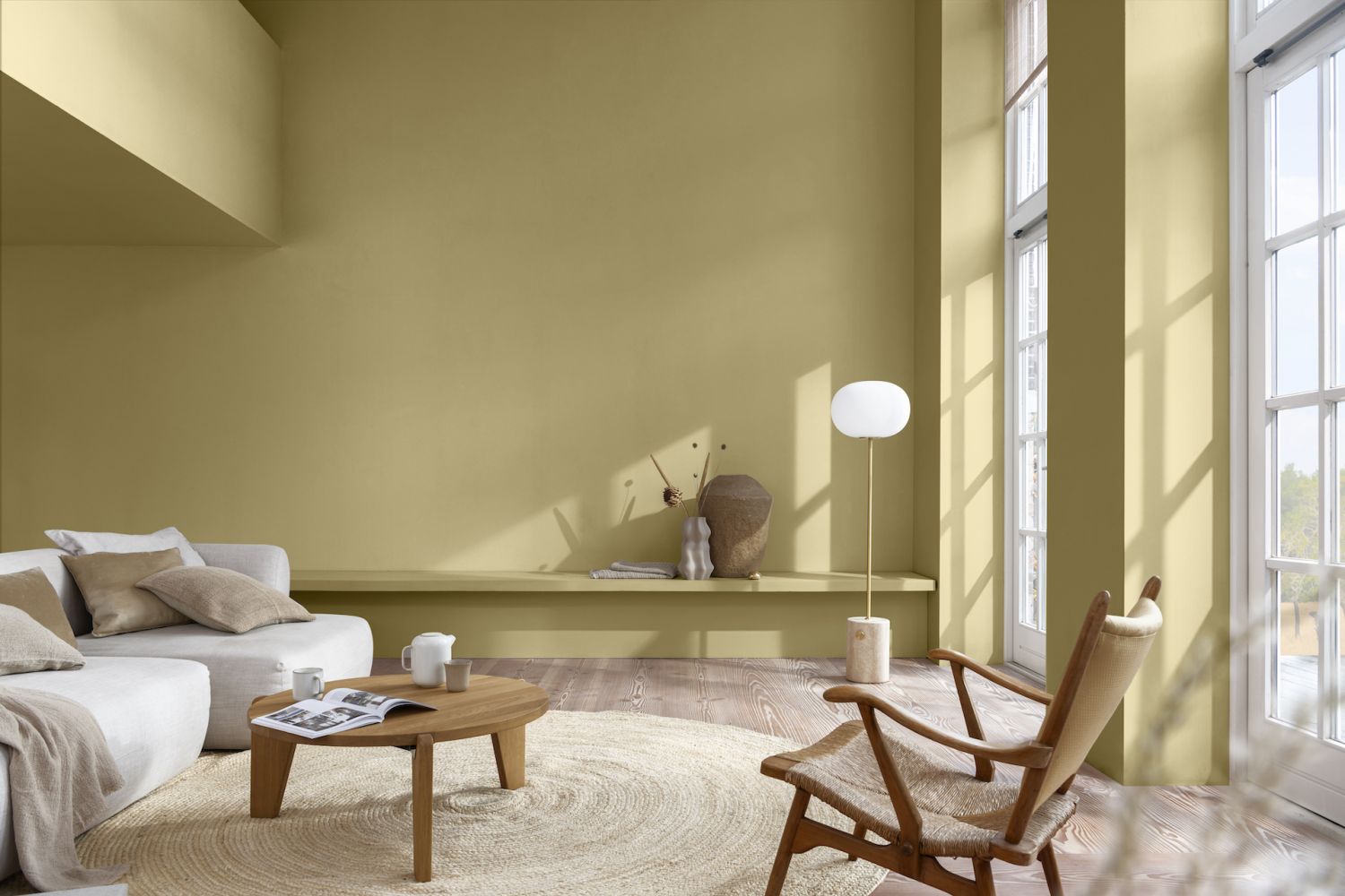
At the other end of the spectrum is Wild Wonder, AkzoNobel’s Colour of the Year 2023. Its upbeat glow is a hue inspired by the warm tones of harvested crops and aims to connect us with nature, creating a sense of energy and positivity.

“Wild Wonder speaks to us in a language we instinctively understand,” says Heleen van Gent, creative director of AkzoNobel’s Global Aesthetic Centre. “Nature is what inspires us and makes us feel better in our lives and our homes. That’s why, for the first time in 20 years, our entire colour palette is inspired by the rhythms of nature.”

Don't miss: Home Tour: A Modern Bungalow in Selangor, Malaysia With Bespoke Details


Tatler Asia
Above Carl Hansen & Søn's Asserbo series

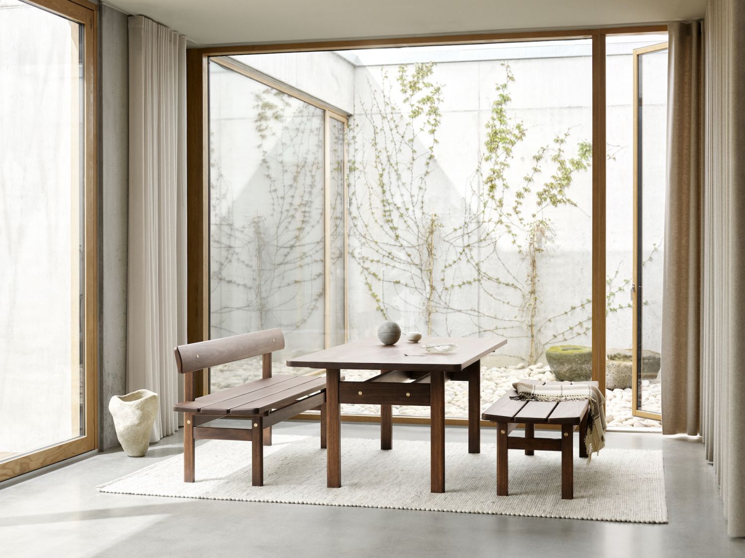
To complement Wild Wonder, consider Carl Hansen & Søn's Asserbo series of furniture. Created in 1961 for Danish designer Børge Mogensen’s private holiday home, the heritage furniture brand has now reissued the pieces in solid, dark-oiled FSC-certified eucalyptus, sourced from sustainable forestry and renowned for its understated beauty and high durability.

Radiating visual calm and straightforward functionalism, the pieces allow the materials to speak for themselves and bear an informal expression perfect for today.

Don't miss: Home Tour: A Minimalist House Inspired By the Work of Japanese Architect Tadao Ando

Tatler Asia
Above Menu low Plinth

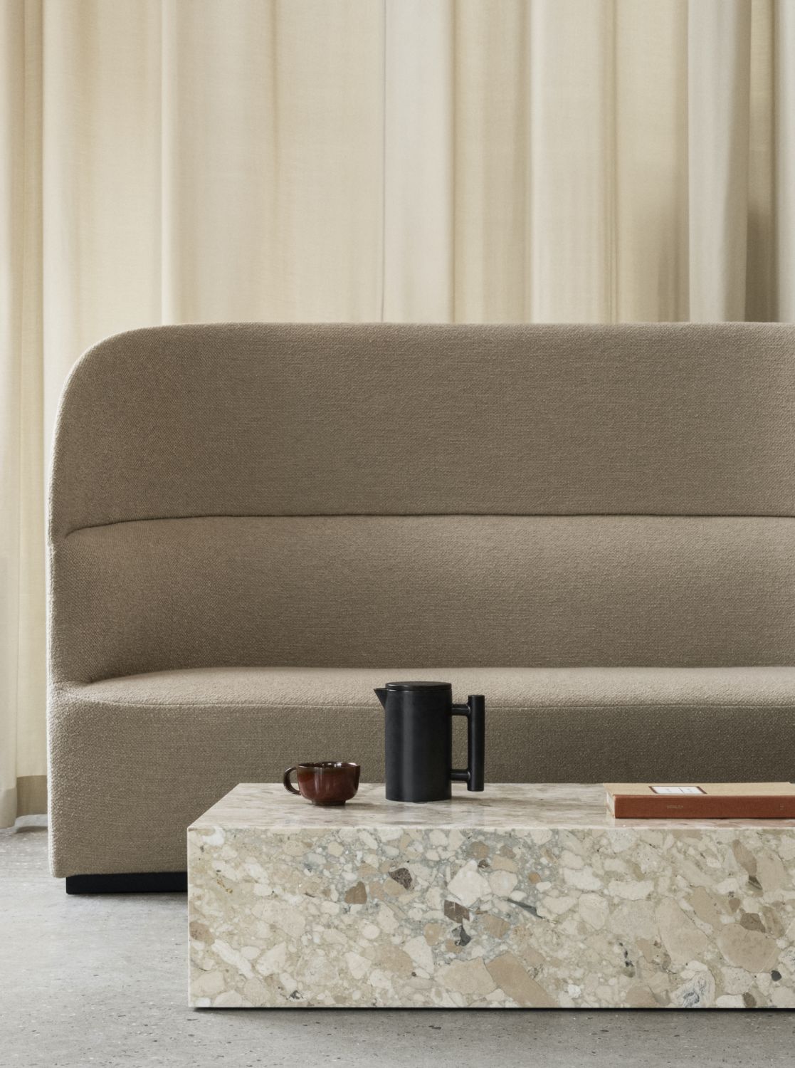
A shade like Wild Wonder pairs well with natural materials, and Menu's Plinth collection, crafted from marble, is just the ticket.

Equal parts beautiful and timeless, the collection of multi-functional marble podiums for every space includes Calacatta Viola, Grey Kendzo, Nero Marquina and White Carrera. It is also available in Kunis Breccia, an artistic blend of stones in warm tones which creates subtle texture and adds a new dimension with its refined and inviting expression. 

NOW READ

Ask a Designer: How To Create a Timeless Modern Look for Your Home

Home Tour: A Beautiful Apartment in Singapore With a Parisian Spirit

Home Tour: A Minimalist Home in Kuala Lumpur with a Tree Growing Inside

Topics