1 / 1
Tatler+
As part of Jaeger-LeCoultre’s Made of Makers programme, the artist has created a new Art Deco-inspired alphabet style for the maison
The worlds of art and horology have long been intertwined, and Jaeger-LeCoultre often embraces this relationship in its timepieces, activities and collaborations. This year, the Swiss luxury watch manufacturer is setting out to further explore and extend the dialogue that exists between art and horology through its new Made of Makers programme, which aims to bring together a community of artists, designers and craftsmen from various disciplines outside of watchmaking.
Having previously collaborated with other creatives like pastry chef Nina Métayer, mixologist Matthias Giroud and multimedia artist Guillaume Marmin, Jaeger-LeCoultre’s intention for the new programme is to work with similarly high-calibre creators who share the maison’s fundamental values of creativity, expertise and precision. The practitioners it collaborates with will be those whose work explore new forms of expression through different, and often unexpected, materials and media.
For its inaugural Made of Makers project, Jaeger-LeCoultre chose to work with Spanish lettering artist, Alex Trochut, who created a new Art Deco-inspired alphabet style for the maison.
Read more: Meet the New Jaeger-LeCoultre Master Control Memovox


Above Spanish artist Alex Trochut (Photo: Jaeger-LeCoultre)
Spanish artist Alex Trochut (Photo: Jaeger-LeCoultre)
1 / 1
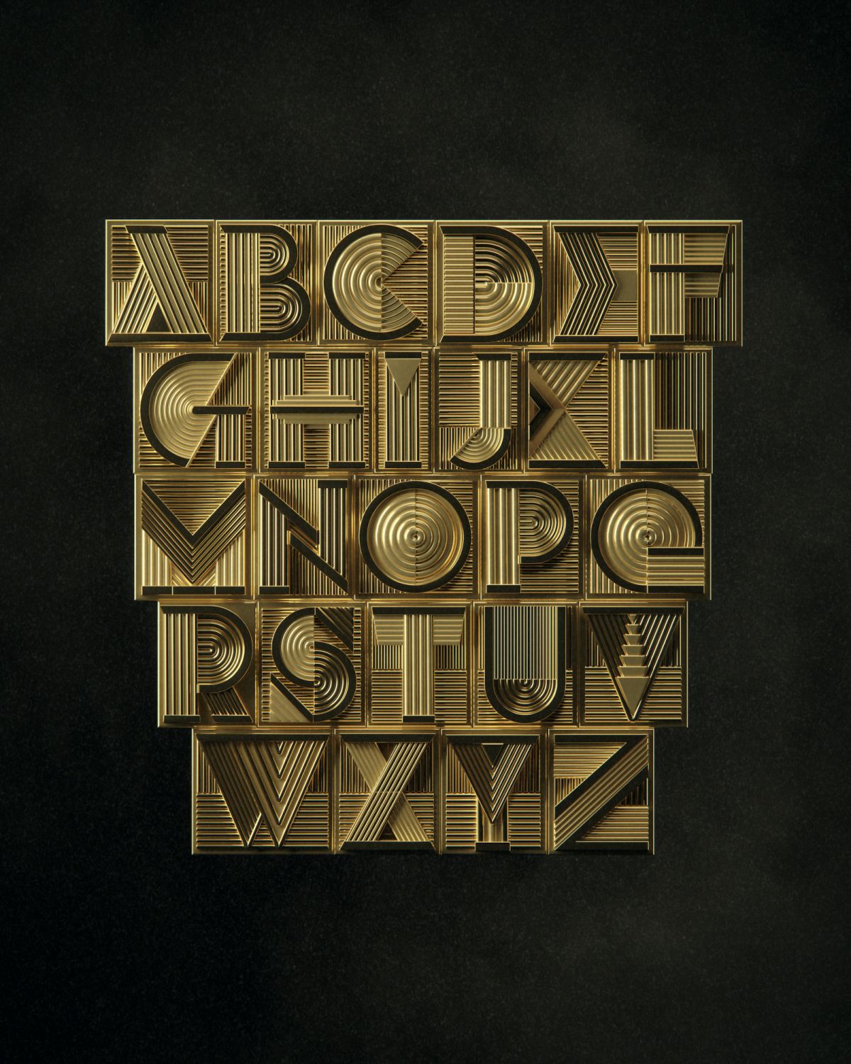
Born in Barcelona and based in New York, Trochut has worked with brands like Gucci and created album covers for Katy Perry and The Rolling Stones. For Jaeger-LeCoultre, the artist created a representation of La Grande Maison’s values through a bold, contemporary alphabet style—the 1931 Alphabet. He looked to Art Deco for inspiration, a style that remains prominent in the landscape of New York and that is of great importance to Jaeger-LeCoultre as the origin of the Reverso wristwatch.
The choice of Art Deco is also incredibly significant for the values it upholds. Back in the 1920s and ’30s, Art Deco was progressive, optimistic and forward thinking for its time, expressing the extraordinary spirit of modernity that swept the world. There was also a fascination for technology and tremendous creative energy that characterised the movement, which Jaeger-LeCoultre continues to identify with.
The new 1931 Alphabet that Trochut has created for Jaeger-LeCoultre is a modern addition to the maison’s visual identity. In a sharp and contemporary take on Art Deco, each letter has a distinctive sculptural quality and strong sense of visual depth, while also conveying a sense of dynamism and movement. As a result, it is equally expressive in two-dimensional form and as three-dimensional objects.
In case you missed it: Tatler Ball 2022: Iconic Runway Looks to Inspire Your Legendary Ensemble
Above The 1931 Alphabet takes inspiration from Art Deco (Photo: Jaeger-LeCoultre)
Above Jaeger-LeCoultre will offer the 1931 Alphabet as a new signature of the house (Photo: Jaeger-LeCoultre)
The 1931 Alphabet takes inspiration from Art Deco (Photo: Jaeger-LeCoultre)
1 / 2
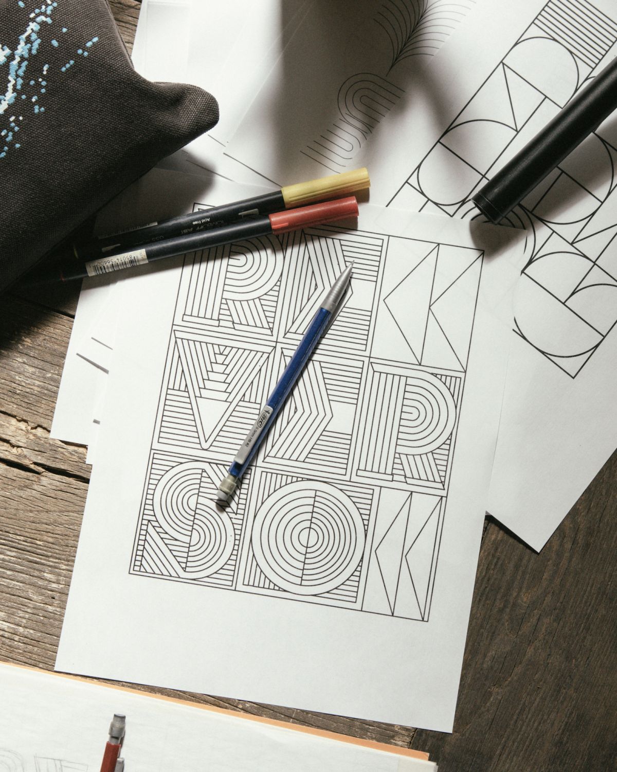
“As I started creating the designs, a concept emerged that would unify Art Deco and Jaeger-LeCoultre’s craft of watchmaking,” says Trochut. “The letters evoked some sort of mechanism, full of different modular parts that work together to create a whole. I wanted these letters to feel physical and expose their intricate parts equally as functional and decorative, giving the sense of a moving machine.”
He adds: “I think craft and technical skills are at the heart of both typography and watchmaking. Letters are a mix of emotional and rational decisions, with a big internal logic that ties all the decisions into one alphabet or lettering form, like a puzzle. While I consider watchmaking to be another level of complexity, both disciplines embody a devotion to the little things, which need to work in harmony inside a system.”
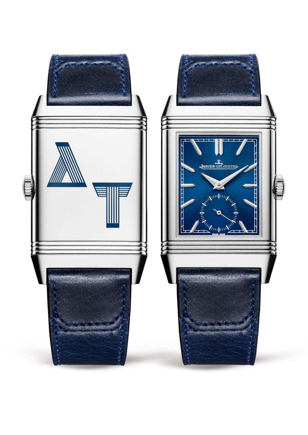
Above Personalised engraving of the 1931 Alphabet on a Reverso caseback (Photo: Jaeger-LeCoultre)

Above Artist Alex Trochut at work (Photo: Jaeger-LeCoultre)
Personalised engraving of the 1931 Alphabet on a Reverso caseback (Photo: Jaeger-LeCoultre)
1 / 2
“We are delighted to work with Alex Trochut,” says Catherine Rénier, CEO of Jaeger-LeCoultre. “His creative work is avant-garde and like our maison, he uses his heritage as a foundation, harnessing that legacy in order to express the present and future in new creative ways.”
As a new signature of Jaeger-LeCoultre, the 1931 Alphabet will be offered as a style of personalisation for engraving on a Reverso caseback. There are also plans to incorporate it into a wide variety of other initiatives in the future.
Discover more about the collaboration with Alex Trochut in Jaeger-LeCoultre’s Marina Bay Sands Boutique, located at B2M-240, Casino Level, The Shoppes at Marina Bay Sands.
NOW READ
The Story of an Icon: All About the Jaeger-LeCoultre Reverso
October 2022: What's New in Watches
You Can Design Your Very Own Audemars Piguet Royal Oak—and Win a Trip to the Watchmaker’s HQ

Annabel Tan is the Editor of Watches and Jewellery at Tatler Singapore, where she covers all things luxury timepieces and fine jewellery across both print and digital platforms. She is also the Editor of Tatler GMT Singapore, a role that deepens her fascination with the ever-evolving world of watchmaking. Outside of work, she’s usually on the hunt for her next favourite watch that she can’t afford, planning her next beach getaway, or catching up on the latest Formula 1 race.