Cover Digitally generated 70s style living room interior design.The scene was rendered with photorealistic shaders and lighting in Autodesk® 3ds Max 2016 with V-Ray 3.6 with some post-production added.
Digitally generated 70s style living room interior design.The scene was rendered with photorealistic shaders and lighting in Autodesk® 3ds Max 2016 with V-Ray 3.6 with some post-production added.
1 / 1
In a short chat with Tatler Homes, interior designer Isabel Lozano shares how a variety of colours can change the way we perceive things
Different colours evoke different feelings. As such, Filipino interior designer and Decorum Management Consulting Services CEO Isabel Lozano puts great importance in incorporating the right hues in the most suitable spaces. Yellow and orange, for example, are good for the kitchen or dining area for they bring out hunger. Blue, on the other hand, is best for bedrooms and study areas for it makes people less stressful and more focused.
For years, Lozano has worked with different personalities and made their respective homes look more pleasing by combining accents that she collated base on her understanding of their lifestyles and preferences. In an interview, Lozano shares why colours are an integral part of designing a space.
In case you missed it: Ramon Magsaysay Award Foundation Launches Interior Design Competition
How important are colours when it comes to setting up the mood at home?
The home is your sanctuary, a place wherein your soul or being can be completely at peace and with your authentic self. Your environment greatly affects your state of mind. Colours can help you connect to that state of your true self or to the mood you desire. Colour Psychology plays a very important role in achieving this and therefore, colours are a very important aspect to consider when creating a mood at home.

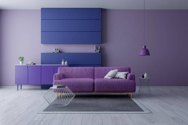
Above Violet stimulates creativity and imagination; Orange evokes optimism
Violet stimulates creativity and imagination; Orange evokes optimism
1 / 1
How can different colours change the way we perceive things?
I am a strong believer that our environment affects our behaviour, mood, and state of mind. The way we perceive the world depends largely on these things and undoubtedly affects human behaviour. Colours and emotions are intricately linked and there are scientific studies and evidence to this fact. Something to keep in mind is the bolder the colour, the more powerful and energetic the effect it has on emotions. Muted colours do the opposite. They give off a more relaxed and low energy effect.
Related: Renovating? Redecorating? Check Out What These Design Experts Have to Say
Here are some examples of colours and their emotional effects. Red: excitement, energy, passion, courage, attention; Orange: optimism, independence, adventure, creativity, fun; Yellow: enthusiasm, opportunity, spontaneity, happiness, positivity; Green: safety, harmony, stability, reliability, balance; Blue: trust, responsibility, honesty, loyalty, inner security; Violet: imagination, spirituality, compassion, sensitivity, mystery; Brown: reliability, stability, honesty, comfort, naturalness; Grey: neutrality, practicality, conservatism, formality, quietness; Black: power, control, authority, discipline, elegance; Ivory and Beige: quietness, pleasantness, purity, calming clean feeling, safety.
Red: to stimulate, create urgency, draw attention, caution, encourage. Orange: to stimulate, communicate fun, draw attention, express freedom, fascinate. Yellow: to stimulate, encourage, relax, awake awareness, energise, uplift. Green: to relax, balance, revitalise, encourage. Blue: to reduce stress, create calmness, relax, secure, create order. Violet: to encourage creativity, inspire, combine wisdom and power, create an impression of luxury, to sharpen intuition. Brown: to stabilise, imply common sense, suppress emotions, create warmth. Grey: to create a sense of composure, depress energy, associate timelessness. Black: to hide feelings, radiate authority, associate with mystery, create elegance. Ivory and Beige: to bring out opulence, virtue, relaxation, neutrality, calmness, serenity, simplicity, safety.
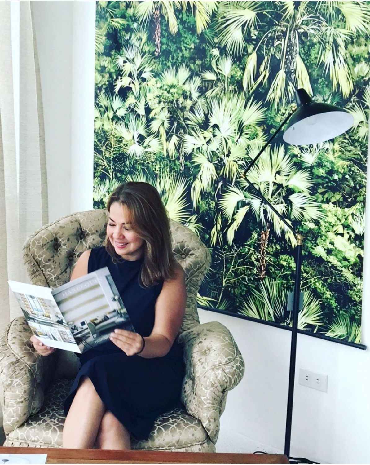
Above Interior Designer Isabel Lozano
Interior Designer Isabel Lozano
1 / 1
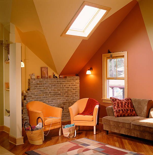
Above Orange evokes optimism
Orange evokes optimism
1 / 1
Which colours effortlessly make a home look more cosy or peaceful?
The definition of “cosy” and “peaceful” can vary for each person. If we were to choose colours that are “peaceful” and that have a more serene, calming effect, it would be neutral colours such as white, ivory, beige, light grey, taupe, soft blues, and greens, or light browns. I believe any muted colour can achieve this, but the neutral colours just mentioned are usually best. As for “cosy”, I have also used muted reds, oranges, yellows and purples to capture this feeling.
Deep and dark colours can be considered cosy if done right, especially with great lighting!
See also: Home Design 101: Which Interior Design Style is the Right One For You?
Which colours should homeowners avoid if they are trying to achieve a peaceful space?
High-energy or high impact colours that belong to the warmer part of the spectrum (red, orange, yellow). I would use colours from the cooler side (blues, green, light purple). Using neutrals such as white, light grey, light taupe, ivory also do the trick especially when you add beautiful touches of nature.
How has colour theory affected the way you design/ conceptualise /work around things?
I am very visual and very sensitive to my surroundings. I cannot help but empathise with the needs of my clients. I always put myself in their shoes as much as I can to fully understand how I can transform their personal space into a sanctuary that connects with their souls. Choosing the right colours based on their preferences, lifestyles and personalities is a very crucial step in the design process. It’s all about making them feel really good.
The home is where we all recharge mentally, emotionally, physically, etc... so we really should pay attention to our environment and how it affects our well-being. This is something I practise myself and hope to help others with through what I do.
NOW READ
Philux Spaces: The Kienle Sisters Share Their Top Interior Design Tips
Interior Design Tips: Where To Buy Tropical Home Decor—Aranaz, Perla Manila, And More
5 IG Accounts To Follow For Contemporary Interior Design Inspiration

Jove holds a degree in Journalism and is currently pursuing graduate studies in Philosophy at the University of the Philippines–Diliman. She has flair for in-depth, interview-driven stories that explore politics and culture, shaped by her background in national broadsheets.
When she’s not on assignment, Jove spends her days painting, sipping lemonade, and walking her dog, Jupiter. She can often be seen in Escolta with a film camera in hand, browsing novelty shops in search of rare memorabilia. For leads, reach her at Jove@tatlerphilippines.com.