Cover Photo: AkzoNobel
Photo: AkzoNobel
1 / 1
While there's no one-size-fits-all solution when it comes to a colour scheme that brings out the best in you, we take a closer look at certain colours that are known to impact mental wellbeing positively, especially in prolonged periods of isolation
Anyone who's undertaken a DIY home painting project will know the vast difference that a fresh coat of paint can do to revitalise your interior. For some, incorporating certain colours like soft green or blue can produce an overall calming effect in their homes. And while each individual's response to a particular colour varies, there's no denying the power of the right shade in hitting that ideal sense of balance and harmony in your room's colour scheme.
If you've ever had a hankering to see green, blue or even purple on your four walls, read on for some styling and colour inspiration for your next home improvement project.
Related: Dulux’s New EasyClean™ Protects Against Common Household Stains And Bacteria
Fun fact: The study of how colours affect a person's physical and mental health is known as colour theory. The influence of this area of research can be seen in the healthcare industry, explaining why some hospital wards utilise light blue or green colour schemes, which are thought to calm, encourage rest and expedite faster healing.
It's been said that colours of red and pink inspire passion and energy, while orange and yellow may even have the power to stimulate one's appetite.
Blue and green for a calming combination


Above This blue bedroom uses a cool blue Dulux shade known as 'Brooding Storm' paired with a light shade of green such as 'Grey Jeans' to create a serene effect (Photo: AkzoNobel)
This blue bedroom uses a cool blue Dulux shade known as 'Brooding Storm' paired with a light shade of green such as 'Grey Jeans' to create a serene effect (Photo: AkzoNobel)
1 / 1
Studies have shown that blue and green contribute to a calm atmosphere, one that's ideal for bedrooms and bathrooms. Has this earthy combination been linked to better sleep? It may or may not, but if you had to choose a colour palette to look at before you sleep, you certainly couldn't go wrong with a soft, pale blue and greyish green combo to create a peaceful and serene space that you'll enjoy coming home to every night.
Related: 8 Colourful Airbnbs To Book When You Restart International Travel
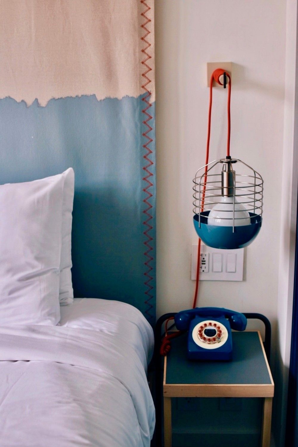

Photo: Unsplash
1 / 3
Purple sparks productivity
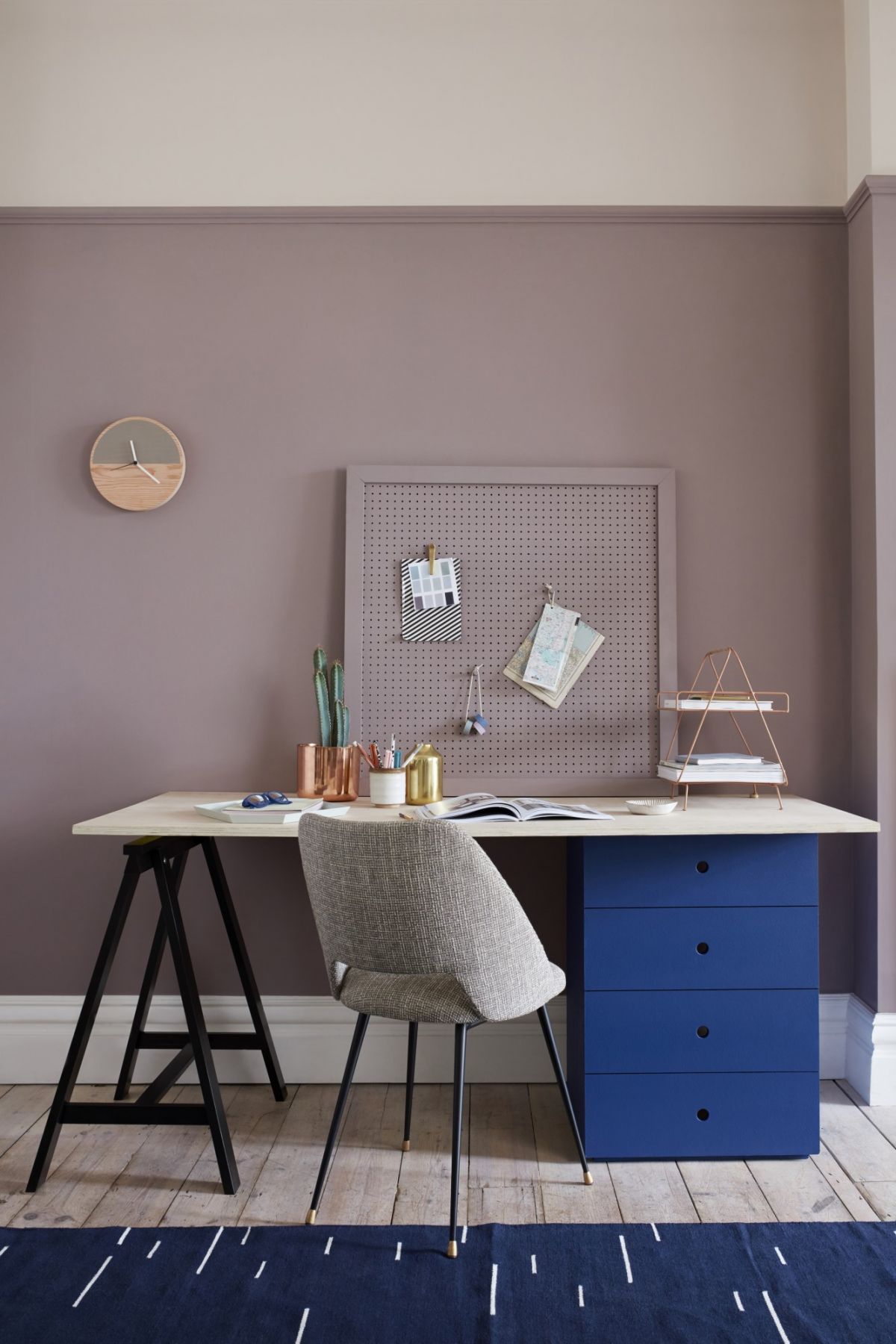
Above This study room uses Dulux's almost lilac-inspired shades of 'Timescape' and 'After The Rain' (Photo: AkzoNobel)
This study room uses Dulux's almost lilac-inspired shades of 'Timescape' and 'After The Rain' (Photo: AkzoNobel)
1 / 1
Can you picture your work-from-home setup in velvety, deep purple?
The colour, said to enhance productivity and creativity, is a surprisingly attractive choice for home office or study. Rather than a shocking purple that's hard to pair with other colours, opt for a muted version which goes beautifully with off-white furnishings and fittings to produce an elegant and timelessly stylish look for the room.
Neutral tones for warmth and versatility
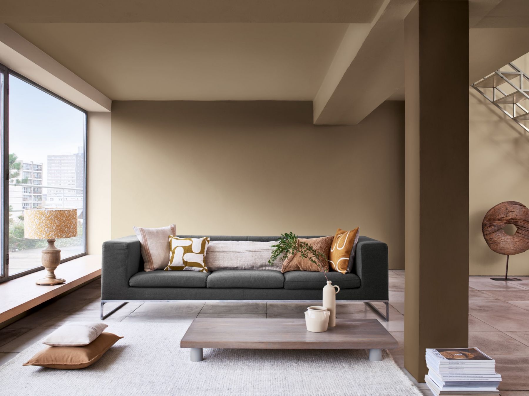
'Brave Ground' is the Dulux Colour of the Year 2021 (Photo: AkzoNobel)
1 / 2
When it comes to the living room colour scheme, think neutral and earthy without compromising on energy and brightness.
A neutral, stone-inspired tone that is somewhere between beige and brown may work better than you'd think in making a large living space feel more warm and welcoming. Additionally, the versatility of neutral tones allows them to pair tastefully with a range of other colours, from bright to strong.
“Whatever shade you decide on, it’s important to remember that the colours we choose to surround ourselves with can play an important role in maintaining our overall mental wellbeing,” muses Heleen van Gent, creative director of AkzoNobel’s Global Aesthetic Centre, home to famed paint brands like Dulux, Sikkens, Interpon and more. "That is why AkzoNobel releases its Colour of the Year every year, to enable consumers to paint their homes with colours that are relevant and truly describe the mood of the moment."
See also: 5 Inspiring Offices That Will Make You Want To Stop WFH
Topics

Previously contributing to Esquire Malaysia, Expat Lifestyle and Newsweek, Tania oversees digital stories across Tatler’s key content pillars, also leading the Front & Female platform exploring issues and topics affecting women today.